What are start pages / spaces?
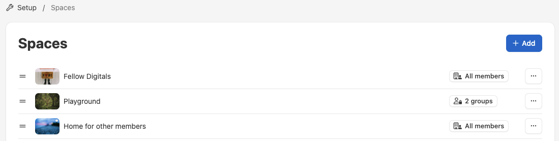
A space (formerly called Start page) is a separate area in your academy. You can use this space to display courses, workshops, pages, news, etc. Your academy can have one or more spaces. Spaces can be visible to all members or just to a specific target group.
Your academy homepage (e.g. https://support.coursepath.com/library) is the relevant homepage.
The space at the top of the space overview is the home page of your academy. It is also possible to create only group-specific spaces and no start pages for all academy members.
Examples
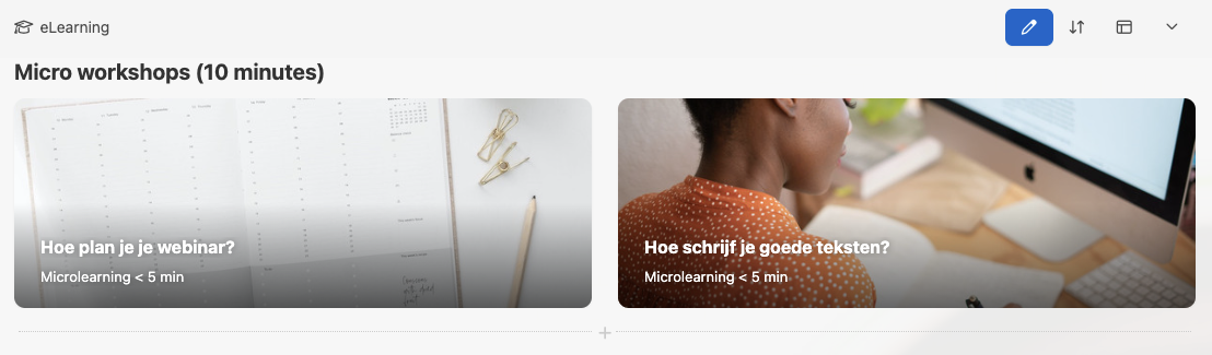
One space can provide a course overview, for example, while another start page displays only wiki pages and another displays courses that are only visible to a specific target group.
This makes it possible, for example, to display three tiles (i.e. start pages) on your homepage that link to different areas. One tile links to courses, another to a wiki and a third to news.
Designing your space layout
You can customize the layout of your homepage and other start pages. Choose between different representations for courses and workshops. You decide whether all tiles/covers are displayed or whether they appear on a slider that you can click through (similar to Netflix).
Creating widget
A widget in Coursepath is a defined area of a space that displays courses, pages and/or workshops. This can either be visible to all members or only to certain target groups.
Accessing widget settings
You can find the widget settings at the place in the space where you want to add an widget.
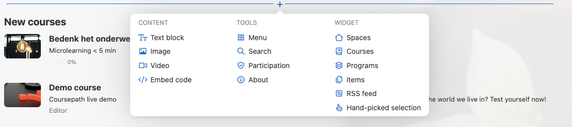
Next you choose which widget, content or tool you want to add to the space.
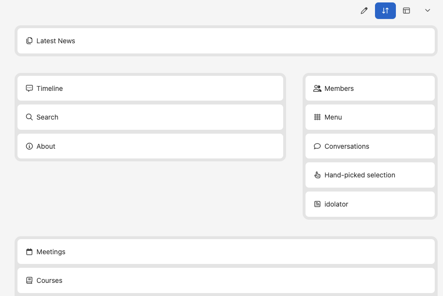
Sorting widgets
In the page editing menu you will find the arrows to Arrange blocks. Arrange blocks will help you to easily sort the widgets on the start page. Sorting them is as easy as drag'n drop by clicking the relevant block, drag it and drop it into the desired place.
Selecting the layout
You can change the layout on the widgets on a start page. You can do that in the appearance tab in the widget settings. Widgets have different settings and display styles to choose from. Take a look at the options displayed in Coursepath in the image below.
Setting up widgets for start pages
Display style
Regarding the format style, you have the following options:
- Tile
- Photo tile
- Article
- Headlines
- Splash
- Springboard
When you switch between these formats, you will see that the size of the image changes, and with it the amount of text that is displayed on the tile.
- Tiles display the course cover photo and below it the course information, while photo tiles display the image as the tile background.
- Articles use a style similar to that of tiles, but the widget does not display a separate tile for each entry.
- Headlines focus more on the course information and display a smaller version of the course cover image.
- Splash is focused on the image. It displays a large image, and only the course or workshop title, your role and progress in the course, as well as the date for workshops.
- Springboard displays the widgets in a specific shape (circle, square and rectangle). You can also configure the text alignment.
You use the number of elements in a row to define whether 1, 2, 3 or 4 tiles/elements are displayed.
Carousel
You can activate a carousel slider for tiles and photo tiles. This displays a content line (i.e. courses, workshops or pages). You can choose whether four, three, two or just one tile should be displayed in this line Clicking on the arrows on the sides will move to the next selection of courses in that widget. When the carousel slider is activated, you can decide whether the slider moves automatically. To do this, select the checkbox to enable autoplay.
When you select three items to display in a row, the carousel slider gives you the additional option to center the slides. When this option is activated, you will see parts of the other slides on either side.
Articles and headlines do not offer the carousel option.
For splash, the carousel slider is automatically enabled. It also has the autoplay option and the centering option for three items. You can also enable a fade effect to apply when an item in a row is selected.
Options
The options give you additional options for designing your widgets. You activate them by selecting one or more checkboxes to hide the image, description or details.
Customizable at any time
You can customize the appearance of the widgets on all your spaces at any time. When you visit your space, a settings button is displayed next to the widgets. You can click to switch between formats and try different combinations.
These settings also provide an easy way for you to go back and edit and customize the displayed content.